
Modern CSS techniques is one of the best way to make the overall web design process. While working with CSS, we might have encountered a few layouts or cross browser compatibility issues. For example, CSS3 styles do not work with the older versions of Internet Explorer.
In order to solve those kind of problems we have come up with some popular CSS techniques. Below are the few techniques used in order to solve the older CSS issues.
Advanced CSS selectors are used to use the CSS file across all the other pages. Below are the few CSS selectors.
Universal selector:
They can be used on all the elements of the website. For example, if you want to have a specific padding to all elements in your page, you have to write in the below way. * indicates the universal selector.
* {padding: 10px;}
Attribute selector:
If we want to apply a specific style to certain elements having similar attributes but different class names, then we can use attribute selectors. Attribute selector will apply padding to elements having class names "component_title" and "component_label".
[class*="component_"] {
padding: 10px;
}
Child combinator:
If we want to make the font-weight of a menu in the navigation bar bold but nav content is dynamically generated. They don’t have any specific class. You can use a child combinator.
.navigation-menu > ul > li > a {
font-weight: bold;
}
Pseudo classes:
Pseudo classes are used to make alternate rows of a table in different colors.
tbody tr:nth-child(odd) {
background-color: green;
}
The above code will apply a green background to the odd rows in the table. Instead of "odd" or "even" we can also use properties like "n+1" or "3n+1" to apply different properties to different rows.
For uniform height for the elements we can use grids or flexbox.
Using Grids
/*Parent container*/
.parent {
display: grid;
grid-auto-flow: column;
}
/*Child elements*/
.child {
height: 100%;
}
Using Flexbox
/*Parent container*/
.parent {
display: flex;
}
/*Child elements*/
.child {
height: 100%;
}

Smooth scrolling is used to slide between the div sections smoothly, so we can see how much it scrolls.
html {
scroll-behavior: smooth;
}
In order to make the element vertically and horizontally centered below code is used.
Using grid
.class {
display: grid;
place-content: center;
}
Using flexbox
.class {
display: flex;
align-items: center;
justify-content: center;
}

If we want to place an element aligned centrally at any particular axis. We have to remove the display property. For vertically center aligned use the below code.
.class {
align-content: center;
}

For keeping an element horizontally centered, instead of align-content, you have to use justify-content.
.class {
justify-content: center;
}

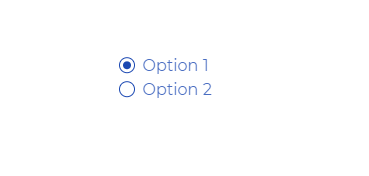
Radio buttons can be styled in a custom way because the default HTML radio button appears differently in different browsers.
HTML code
<label class="radio radio-gradient">
<span class="radio-input">
<input type="radio" name="radio">
<span class="radio-control"></span>
</span>
<span class="radio-label">Option 1</span>
</label>
<label class="radio radio-before">
<span class="radio-input">
<input type="radio" name="radio">
<span class="radio-control"></span>
</span>
<span class="radio-label">Option 2</span>
</label>
We have added a class .radio to the labels. We are using grid-gap to add some spacing between the button and the labels. We will also be using :focus-within and transform so that the size of the label scales up when that particular option is in focus.
CSS code
:root {
--color: green;
}
.radio {
display: grid;
grid-template-columns: min-content auto;
grid-gap: 0.5em;
color: var(--color);
}
.radio:focus-within .radio-label {
transform: scale(1.05);
opacity: 1;
}
We will adjust the line-height, add a transition and also reduce the opacity of the label when the option is not in focus.
.radio-label {
line-height: 1;
transition: 180ms all ease-in-out;
opacity: 0.8;
}
We will add a display-flex to the button that wraps the custom control and the native input.
We will also use a double box-shadow on the focused stage and ensure a difference between the base button and the focused stage.
.radio-input {
display: flex;
}
.radio-input input {
opacity: 0;
width: 0;
height: 0;
}
.radio-input input:focus + .radio-control {
box-shadow: 0 0 0 0.05em #fff, 0 0 0.15em 0.1em var(--color);
}
Adding a style when the button is checked.
.radio-gradient input:checked + .radio-control {
background: radial-gradient(var(--color) 50%, rgba(255, 0, 0, 0) 51%);
}
Creating the :before element, to animate the button when it is unchecked.
.radio-before .radio-control {
display: grid;
place-items: center;
}
.radio-before input + .radio-control::before {
content: "";
width: 0.5em;
height: 0.5em;
box-shadow: inset 0.5em 0.5em var(--color);
border-radius: 50%;
transition: 180ms transform ease-in-out;
transform: scale(0);
}
.radio-before input:checked + .radio-control::before {
transform: scale(1);
}
Finally, adding the style to the radio button.
.radio-control {
display: block;
width: 1em;
height: 1em;
border-radius: 50%;
border: 0.1em solid var(--color);
transform: translateY(-0.05em);
}
Accessibility is very important because the website should be accessible to the differently abled people also. Most of the time, we remove: focus outlines on buttons or links to get rid of the default style.
Below code is used to add focus to the button.
button:focus {
outline-color: #1b48b2;
outline-offset: 0.2px;
outline-style: solid;
}

Copyright © 2026 Website by NectarSpot Marketing, Automation, and Design Company